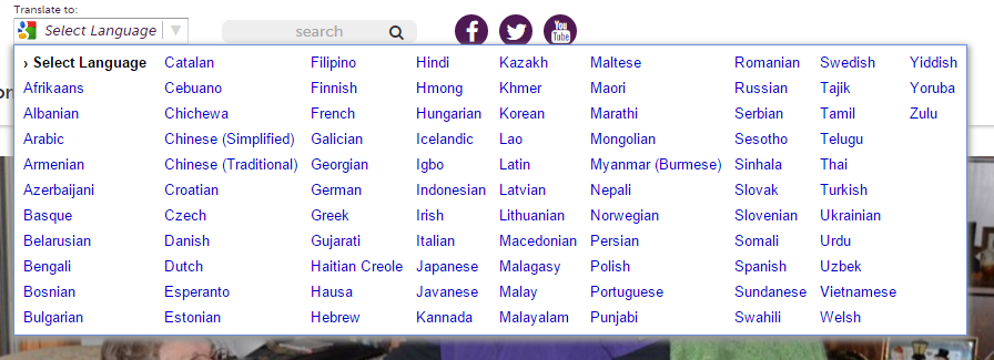
It's not uncommon for a client to need a way for visitors to translate their website without rewriting all their content. Fortunately, as with most things, Google has a convenient widget for this - the Google Website Translator. This handy thing will give you some code to drop on your website, giving you a nice little dropdown like so:
That's all very nice, but it turns out, it isn't very mobile friendly:
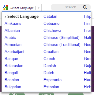 You can't scroll here...
So we need to apply some custom styles to our little widget here. This is useful for any number of reasons - not just making it mobile friendly, but perhaps you want to brand it a bit or add a Nicholas Cage gif as the background or who knows, whatever.
 Don't cry, we'll figure this out
Basic instinct, update my site styles. To get, at minimum, mobile friendly, we'll need this much:
.goog-te-menu-frame {
    max-width:100% !important; //or whatever width you want
}
.goog-te-menu2 { //the element that contains the table of options
    max-width: 100% !important;
    overflow: scroll !important;
    box-sizing:border-box !important; //fixes a padding issue
    height:auto !important; //gets rid of vertical scroll caused by box-sizing
}
Our iframe is now bound to the width of the screen, but the menu styles aren't working. Why? The way this widget works is by creating itself in an iframe. Yeah, kind of odd, but it's probably been around a while. Now if this were a cross-domain iframe, we'd be out of luck at this point. Fortunately for us, the iframe doesn't have a URL at all, so we can use Javascript (read: jQuery) to get the job done by grabbing the contents of the iframe and styling those:
$('.goog-te-menu-frame').contents().find('.goog-te-menu2').css(
    {
        'max-width':'100%',
        'overflow':'scroll',
        'box-sizing':'border-box',
        'height':'auto'
    }
)
Don't get too excited, because even this won't work because the iframe is being loaded asynchronously - can't apply styles to something that isn't there. So now we need to actually wait until the element exists. This solution is rather rudimentary - keep calling the function so long as the item doesn't exist - but it gets the job done:
function changeGoogleStyles() {
    if($('.goog-te-menu-frame').contents().find('.goog-te-menu2').length) {
        $('.goog-te-menu-frame').contents().find('.goog-te-menu2').css(
            {
                'max-width':'100%',
                'overflow':'scroll',
                'box-sizing':'border-box',
                'height':'auto'
            }
        )
    } else {
        setTimeout(changeGoogleStyles, 50);
    }
}
changeGoogleStyles();
Inspect the element and it looks good, until you actually click on the element, and then - big surprise - Google restyles the dropdown every time you click on it. Our new styles - max-width and overflow - do okay, but we lose our box-sizing and height, so while we can scroll, the text goes beyond the scrollable distance on the right side. Even if we could add !important to our jQuery-injected styles, they'd be overwritten. How can we get them to persist?
Instead of injecting styles on the elements, let's inject a whole inline stylesheet to the iframe:
function changeGoogleStyles() {
    if(($goog = $('.goog-te-menu-frame').contents().find('body')).length) {
        var stylesHtml = '<style>'+
            '.goog-te-menu2 {'+
                'max-width:100% !important;'+
                'overflow:scroll !important;'+
                'box-sizing:border-box !important;'+
                'height:auto !important;'+
            '}'+
        '</style>';
        $goog.prepend(stylesHtml);
    } else {
        setTimeout(changeGoogleStyles, 50);
    }
}
changeGoogleStyles();
And that will style our translate widget.
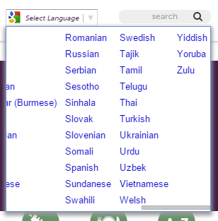 Fits just right!
And remember, you can use this to apply any styles you like, not just the example I've given. Like this solution? Give me internet points!